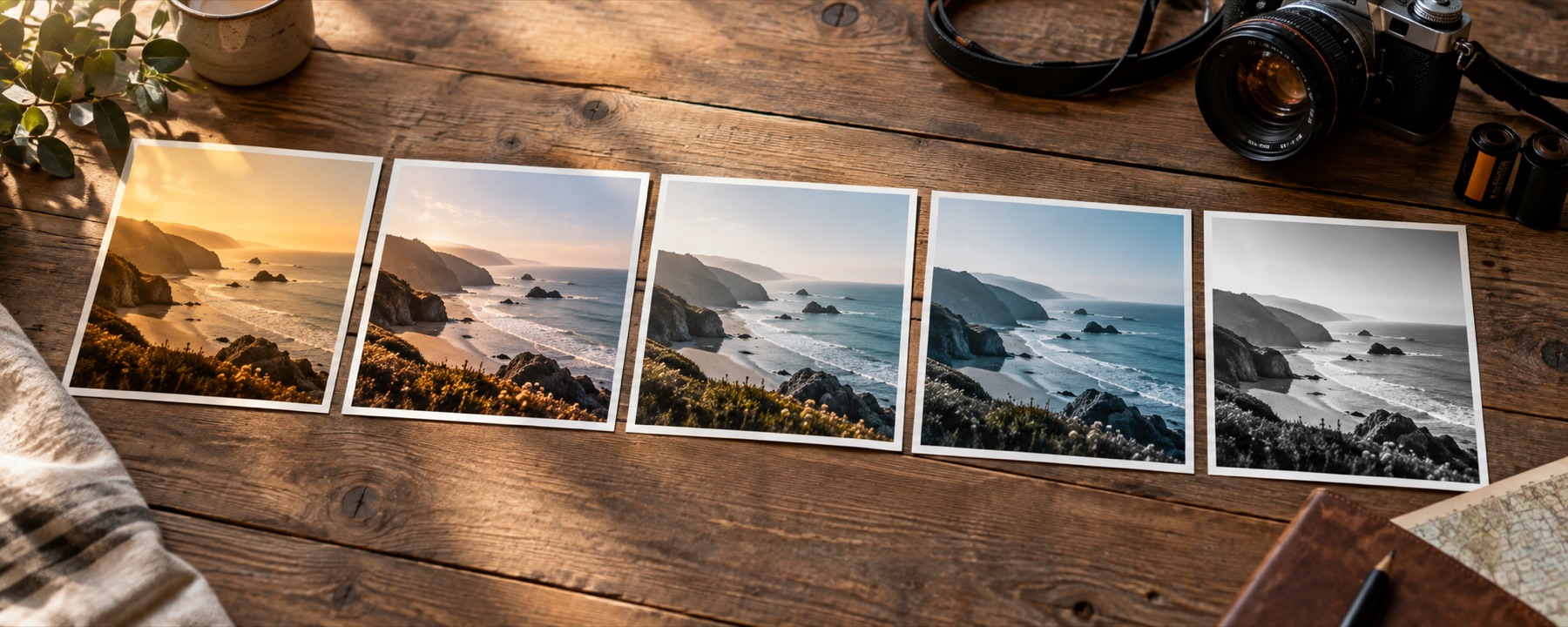
What a look does
A look is a colour decision and nothing else. Underneath every tile on that rail is one table with 35,937 entries in it: for each of thirty-three steps of red, green and blue, the colour that should come out. Your photograph is read one pixel at a time, its colour is found in the table, and the answer is written back in the same place. The grid is never redrawn. Nothing is added, nothing is removed, and the picture is exactly as sharp on the way out as it was on the way in.
That is what separates the twenty-four looks here from the other half of what people mean when they say “filter”. A grade changes what colour a thing is. The other kind changes what the thing is made of — replacing the smooth run of a sky with dots, or steps, or characters. Both are worth having; they are not the same operation and they do not belong behind the same slider. The explainer below sorts any filter you meet into one side or the other in a single question.
None of these looks ships as a file. A thirty-three-step table written out as text runs to about seven hundred kilobytes, and twenty-four of those would be seventeen megabytes of colour data on a page that has two hundred kilobytes to spend in total. Each look is stored instead as a short recipe — a few curves, a channel weighting, a colour pushed into the shadows — and the table is built from it on your device the first time you ask for that look. It takes a handful of milliseconds and then it is cached for the rest of the visit.
Working the rail
The rail opens on eighteen: six from each pack, so the first thing you see spans the whole range rather than one corner of it. The four chips above it swap what the rail shows — Picks, then Film, Faded and Mono on their own, eight apiece — and the number keys 1 to 4 do the same thing without the mouse. Left and right arrows walk along the looks; up and down move the strength by five; zero puts it back to a hundred.
Holding the space bar shows the photograph as it arrived, for as long as you hold it. That is the control most worth learning here. A grade you have been staring at for thirty seconds starts to look like the truth, and the only reliable way to tell whether it is an improvement is to put the original back for a second and watch which one your eye prefers when it is not expecting to.
The strength slider does its work twice. While you drag it, the preview redraws at screen size, which is why it keeps up. When you let go, the same grade runs again at the photograph’s real size through the identical call the download uses — so if your graphics driver is going to object to a forty-megapixel frame, it objects while you are still looking at the settings rather than after you have pressed save.
Whatever is selected stays selected when you open the next photograph. That is not laziness about clearing state; it is the mechanism for making a set of pictures look like they belong together. Choose the look and the strength once, then feed the rest of the shoot through one at a time and the colour decision is already made.
What it opens and what it gives back
JPG, PNG, WebP, GIF, BMP and ICO all go through the browser’s own decoder. A TIFF does not: there is no TIFF decoder in this page, the file is handed to the browser as an image, and only Safari accepts one — on Chrome and Firefox a TIFF will not open here at all. HEIC — what a recent iPhone writes unless you have told it otherwise — needs a WebAssembly decoder of about a megabyte and a half, which is fetched the first time one is actually opened and is absent from the page until then. Orientation is settled before anything else happens: a two-pixel test image is decoded to find out whether this browser rotates by itself, and the rotation is applied by hand only if it did not, which is what stops a phone photograph arriving on its side or turned twice.
Some files change what gets said rather than what gets done. Everything is reduced to eight bits per channel before grading, because a lookup table with enough entries for sixteen-bit input is not something anyone should be asked to download. An animated GIF or WebP contributes its first frame and only that. CMYK and Display P3 are the honest gap: what reaches the shader is whatever the browser decided to hand over when the picture became a texture, this page neither performs nor verifies a conversion, and browsers do not agree with one another about it. A very saturated red from a P3 phone may not survive as the red you saw. That is unverified rather than handled, and it is said here rather than left to be discovered.
Out comes JPG at a quality you set between 60 and 100, or PNG, or WebP, at the photograph’s original pixel dimensions. Metadata is the one place this site takes a side: on a JPG saved from a JPG, the camera body, the lens, the focal length, the exposure and the date all travel across, and the location tags are removed every single time with no setting to keep them. Photographers want the capture data. Nobody needs the coordinates travelling with a picture they are about to put on the internet.
Above roughly 32 megapixels — 16 on iOS, where the canvas limit is far lower — you are offered a lighter working copy as a choice rather than told no. Past 100 megapixels, or 120 MB of file, the tool stops and says which limit it hit. A look is colour, so a lighter copy is graded to exactly the same colours as the full frame would be; the only thing you give up is pixel count.
Two things a look cannot do
Both of these are limits of the operation, not gaps in this implementation.
- A look cannot bring back what the camera did not record. Grade a sky that was blown out to flat white and you get a graded flat white sky: there is no detail underneath it for a table to find, because the file records the same maximum value across the whole area. Lifting a shadow that was recorded as near-black works the same way — the noise comes up with it and the detail does not, because the detail is not in the file. Frames that need their light corrected rather than their colour decided are a different job on a different page.
- A look cannot turn one camera into another. A table built for a particular sensor and a particular log profile assumes the picture going in was recorded that way, and a phone JPG was not — it has already had a curve and a colour rendering baked into it by the phone. Apply a cinema grade to it and the result is not that camera's colour; it is a phone photograph with a second set of decisions stacked on top of the first. Sometimes that is lovely. It is never a conversion.
Things people ask
- Why do the thumbnails take a moment to appear, and why are they my photograph?
- Because they are being drawn, not fetched. Every tile is your own picture pushed through that look's colour table, which is the only honest way to show what a look will do — a grade that reads beautifully on a sunlit beach can be unusable on an indoor portrait, and a rail of stock swatches would never tell you that. The pause is the eighteen tables being built and eighteen draws going to the graphics chip, and it happens once per picture.
- What is the strength slider actually mixing between?
- Your picture and the fully graded version of it, channel by channel, at whatever fraction you have set. At 40 the result is 40 per cent of the way from one to the other. The mix happens in the same colour space the grade happens in, which is sRGB as your file encodes it — mixing the same two values after converting to linear light lands on a slightly different midtone, and the two answers are both defensible, so the one in use is written down here rather than left as a surprise.
- The Mono looks are not all the same grey. Is one of them wrong?
- No — they disagree on purpose. Turning colour into grey means deciding how much each of the three channels contributes, and there is no neutral answer. Weight red heavily and a blue sky goes almost black. Weight green and foliage lifts while warm marks on a face go dark. All eight are correct conversions of the same photograph; they are eight different opinions about what the picture is of.
- Does a look change the picture itself, or only its colour?
- Only its colour. Every look here is a lookup: a pixel goes in, a different pixel of the same size comes out in the same place. No grid is redrawn, no pattern is laid over anything, no edges are found or thickened. Your photograph has exactly as much detail after a look as it had before, which is also why a look cannot rescue anything that was missing to begin with.
- My photograph has a transparent background. What happens to it?
- It survives, and it is never graded. The shader reads the alpha channel, passes it through untouched and applies the table only to the colour. Save as PNG or WebP and the transparency comes out the other side. Save as JPG and it cannot — the format has no alpha channel at all — so the clear areas are written as white.
- I opened a picture that is already black and white. Why do the colour looks barely do anything?
- Because a colour table only has instructions for colours that are present. A grey photograph sits on the neutral axis running through the middle of the cube, so a look can move it lighter, darker or into a tone, but it has no reds or greens to shift because there are none in the file. You get a tone rather than a grade, and the Mono pack is the honest place to be with a picture like that.
Which format to save a graded picture as
The save row offers three, and the choice matters more after a grade than before one. Pushing contrast into a photograph stretches gentle transitions across more levels than they occupied in the original file, so a sky that compressed cleanly at the start can come out of the same encoder with rings in it afterwards. That is not the look misbehaving; it is the encoder being asked to describe a harder picture with the same budget it had before.
JPG, at 92 unless you have a reason
The default, and right for nearly every graded photograph that is going somewhere other than back into an editor. It is also the only format here that carries the capture data across, so if the camera body and the exposure matter to you, this is the one. Drop the quality much under 80 and a strong grade starts to show where the encoder gave up first — usually a smooth sky, and usually before anything else in the frame looks wrong at all.
PNG, when nothing may be approximated
Every pixel comes out exactly as the table computed it, transparency included, and the file is large in a way that surprises people — a photograph is the worst case for the compression PNG uses, and a frame off a modern camera can land past fifteen megabytes. Worth it when the picture still has work to come, or when it has an alpha channel you need to keep, and a poor trade for anything headed straight to a web page.
WebP, and the check that runs before it
Smaller than JPG at a matching quality, and it keeps transparency, which is the pair of properties that makes it worth offering. It loses the Exif block, because the carrier here only knows how to move one across a JPEG. The option is also tested rather than assumed: two pixels are encoded and the type of what comes back is read, because an older browser will hand back a PNG labelled as one and say nothing, and a save button that silently produces the wrong file is worse than one that is absent.
Where the rest of this site is
One other route opens this same instrument on a narrower shelf of the library. The film pack is eight colour negative and slide behaviours with a note against each one saying what it does to a face, which is the thing eighteen small thumbnails genuinely cannot show you — a shift of a couple of degrees in the midtones is invisible on a hillside and immediately wrong on a cheek.
The written pieces are the other direction: three pages that argue for the decisions this one only states. Which kind of filter you are actually looking for, what the eight greys are really disagreeing about, and how far one look carries a run of photographs before your own judgement has to come back in.