

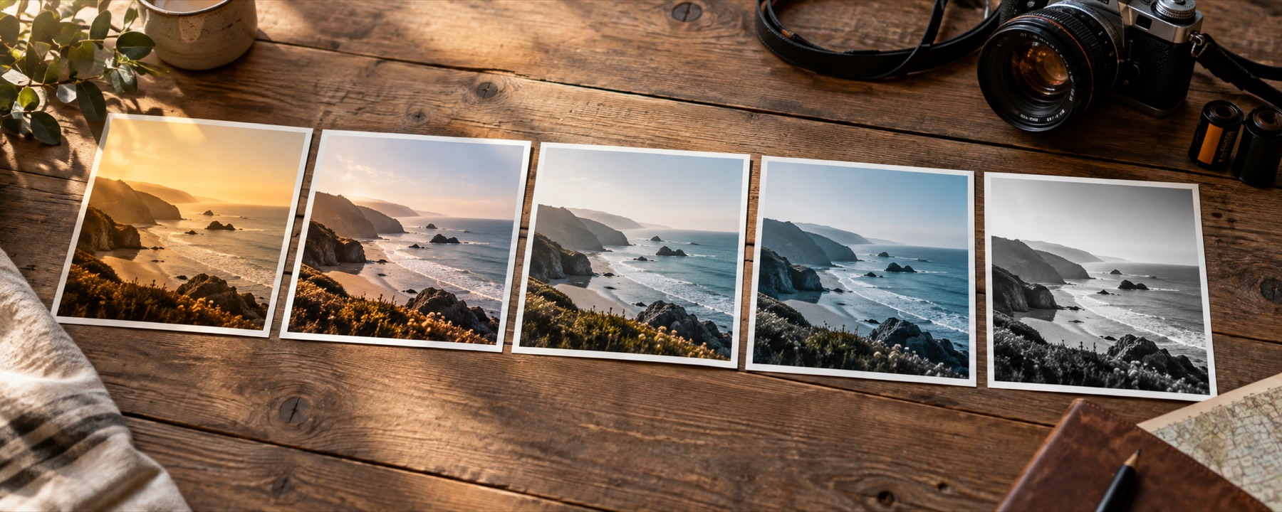
The decisions inside this shelf
A faded print loses density unevenly. Its darkest areas often lift first, the top of the tonal range compresses, and dyes drift at different rates so shadows and highlights lean in different directions. These looks model that tonal and colour response without claiming that a clean digital file has acquired physical paper, dust or damage.
| Look | What it does |
|---|---|
| Faded Print | Blacks lifted to a soft grey, contrast gone slack, colour drifting warm the way a print in a frame does. |
| Sun Bleached | Highlights blown out toward paper, colour drained from the top end, the shadows still holding. |
| Seventies Warm | Orange through the whole frame, greens pushed toward olive, a low ceiling on contrast. |
| Instant Square | Cyan crawling into the shadows, warm paper in the highlights, and not much room between them. |
| Sepia Wash | All colour removed, then a single brown laid back over the whole tonal range. |
| Dusty Rose | A pink cast in the light and a cool floor beneath it, with the saturation kept low. |
| Bleach Bypass | Most of the colour gone and the contrast hard — the look of silver left in the print. |
| Old Paper | Yellowed stock: blue pulled out of the highlights, everything sitting on a cream floor. |
Choose with the photograph, not the name
Check the black point before the colour cast. If the lifted floor removes the separation the subject needs, reducing strength is more useful than choosing a more theatrical cast. Portraits also need a skin check at full size: a thumbnail can make a cyan shadow feel elegant while the same shift makes lips or under-eye colour implausible.
The strength control is part of the decision. A look at forty per cent is a blend between the original and the complete transform, not a second weaker recipe, so comparisons remain predictable.
What this family cannot repair
- No fixed table can know the age, storage, paper chemistry or scan profile of a real print. The names describe a visible behaviour, not an authenticated period process, and the result should be treated as a grade rather than restoration history.
- A look remaps colours that exist. It cannot recover a clipped highlight, separate a noisy shadow, sharpen missed focus or restore detail that the source never recorded.
Questions about this shelf
- What makes a look read as faded?
- Usually a raised black floor, compressed contrast and a colour cast that differs between shadows and highlights. Age does not simply lower saturation everywhere.
- Does this add scratches or paper texture?
- No. These are colour and tone responses. Texture overlays are spatial effects and would be a different tool with different controls and failure cases.
- Why does the same vintage look vary between photos?
- A lookup table responds to the colours and brightness already present. A flat phone image, a contrasty JPEG and a camera file rendered with a warm profile begin from different inputs.
Continue through the library
- Film looksThe eight emulations on their own, with what each one does to skin written down.
- Black and whiteEight channel and tonal decisions for turning colour into grey.
- A look versus an effectOne test that sorts any filter you meet into the two kinds, and says which site handles which.
- The look railTwenty-four looks in three packs, every tile drawn from the photograph you opened.