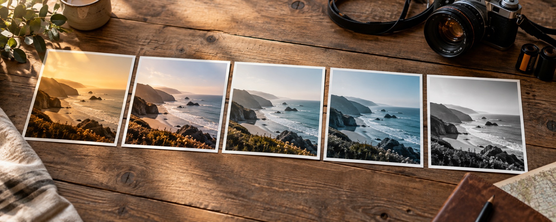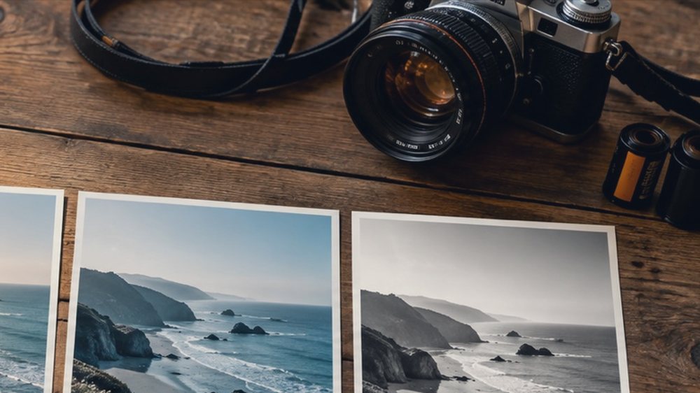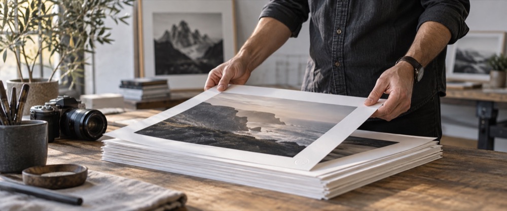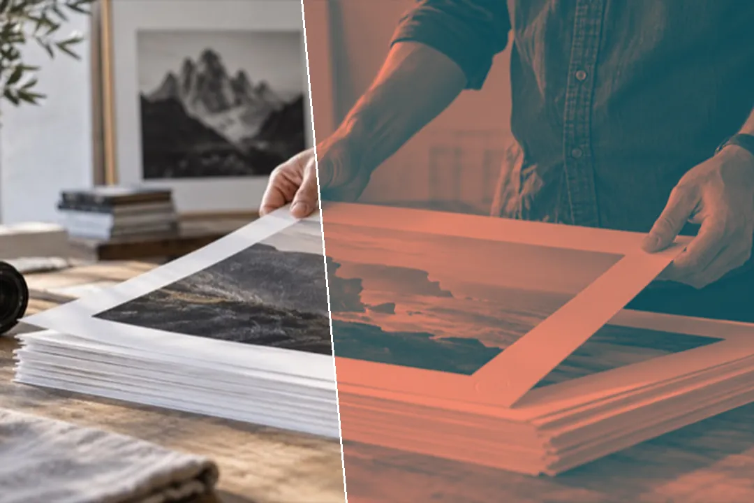
Map your photo's brightness onto two colours you choose — or three for a tritone — with the contrast between them shown, for posters, banners and covers.
Brightness, painted in two colours
A duotone ignores what colour each part of the photo was and keeps only how bright it was. The shadows take your first colour, the highlights take your second, and the midtones slide between them. Because it is a colour operation, it runs inside the same colour table as every other look here, so it costs nothing extra and comes out of the full-size save exactly as the preview shows.
It sits at the very end of the recipe, after the black-and-white channel mix, curves and tone, so those controls still decide which parts of the photo end up light and which end up dark. For a softer, single-colour wash try sepia toning; for a tint that keeps the photo’s own colours, a colour filter.
Picking a pair
Keep one colour dark and one light. The contrast ratio on the panel is the same number accessibility checkers use for text: 4.5:1 or more means body text in one colour over the other will be readable, 3:1 is enough for large headlines only. A tritone adds a third colour in the middle, which is how sunset-style posters get their glow.
What it cannot do
- A duotone replaces the photo's colours with yours. Nothing of the original hue survives at 100 per cent.
- Two colours with little contrast between them give a flat picture; the ratio on the panel warns you.
- This is a colour operation only: it does not add halftone dots, paper texture or misregistration.
Questions
What is a duotone?
A picture printed in two inks instead of four. Here it is done as a gradient map: each pixel's brightness picks a colour on the line between your shadow colour and your highlight colour, so the darkest parts take the first colour, the brightest the second, and everything in between a mix of the two.
How do I pick two colours that work?
Start from a preset, then move one colour at a time. Keep one colour dark and one light: the page shows the contrast ratio between them, and anything under about 3:1 turns into a flat, muddy picture. A deep, saturated shadow with a pale, warm highlight is the classic poster look.
Can I add a third colour?
Yes. Tick 'Add a midtone colour' for a tritone: brightness then runs from the shadow colour through the midtone colour to the highlight colour. The Balance slider moves where the middle sits.
Does a duotone keep any of the original colour?
No. Hue is thrown away completely and only brightness survives. Lower the Duotone amount if you want some of the photo's own colour to show through underneath.
Why does the page show a contrast ratio?
Duotones are often used behind text on banners and posters. The ratio is the WCAG contrast between your two colours, so you can tell at a glance whether text set in one colour over the other will be readable.
Nearby on this site
- Black and whiteEight channel and tonal decisions for turning colour into grey.
- Sepia filterSepia, selenium, cyanotype, gold, platinum and copper toning, with split toning and a keep-colour amount.
- Colour filters for photosBlue, pink, gold, purple and any other gel over the lens: multiply, soft light, colour or screen.
- Photo filter editorBuild a filter from scratch, name it, and take it with you as a link, a card, JSON or a .cube.