The decisions inside this shelf
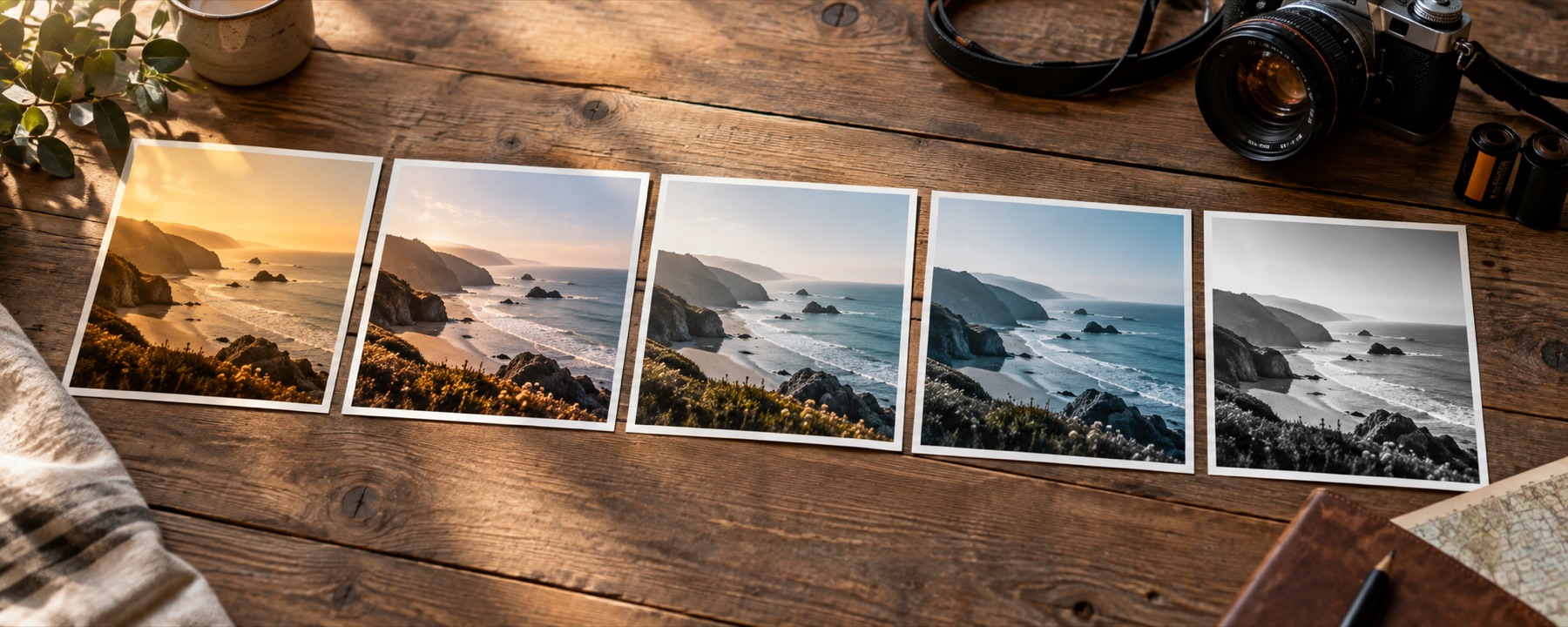
Monochrome is not colour with a switch turned off. Every grey value has to be calculated from red, green and blue, and changing their weights changes which subjects separate. The shelf includes neutral luminance, coloured-filter responses and tonal treatments that move the black and white endpoints after conversion.
| Look | What it does, and what it does to skin |
|---|---|
| Plain Mono | Luminance weights, unmodified. The reference every other entry in this pack departs from. |
| Hard Mono | The same weights with the contrast driven up until the midtones separate sharply. |
| Red Filter | Weighted heavily to red: blue sky goes nearly black and cloud stands off it. |
| Orange Filter | The landscape weighting — sky darkened, but less brutally than red, and skin kept light. |
| Yellow Filter | A gentle darkening of blue. The one to reach for when the others look theatrical. |
| Green Filter | Green weighted up: foliage lightens, lips and warm marks on skin darken and read clearly. |
| Soft Silver | Low contrast with the black point lifted, so the darkest area is grey rather than empty. |
| Deep Black | Blue weighted up and the toe pulled down, which puts most of the shadow detail away. |
Choose with the photograph, not the name
Begin with the subject. A red response can give pale skin and a dramatic dark sky but can erase red marks; a green response separates leaves and can make blemishes darker; blue usually makes skin texture harsh. Hold the original under the space bar, then compare the face or object rather than judging only the overall thumbnail.
The strength control is part of the decision. A look at forty per cent is a blend between the original and the complete transform, not a second weaker recipe, so comparisons remain predictable.
What this family cannot repair
- A colour-filter response is a digital weighting inspired by how coloured glass changes black-and-white capture; it does not reproduce a particular film emulsion, grain structure, development process or paper.
- A look remaps colours that exist. It cannot recover a clipped highlight, separate a noisy shadow, sharpen missed focus or restore detail that the source never recorded.
Questions about this shelf
- Why are there several correct black-and-white versions?
- A colour pixel has three channel values and grey has one. Converting it requires a weighting decision. A red-heavy mix darkens blue sky; a green-heavy mix lifts foliage; neither is mathematically neutral.
- Is pulling saturation to zero the same thing?
- It is one conversion, but usually a weak one because it gives the channels no subject-aware weighting. The named mono looks expose different weightings and tonal endpoints.
- Will the original colour return after export?
- No. The downloaded image contains the rendered grey RGB values. The original file is never changed, so keep it and return to it for another interpretation.
Continue through the library
- Film looksThe eight emulations on their own, with what each one does to skin written down.
- Vintage looksFaded-print responses with lifted blacks and colour drift.
- Black and white is a channel decisionWhy pulling the saturation to zero is the worst mono you can get, and what the eight weightings do instead.
- The look railTwenty-four looks in three packs, every tile drawn from the photograph you opened.