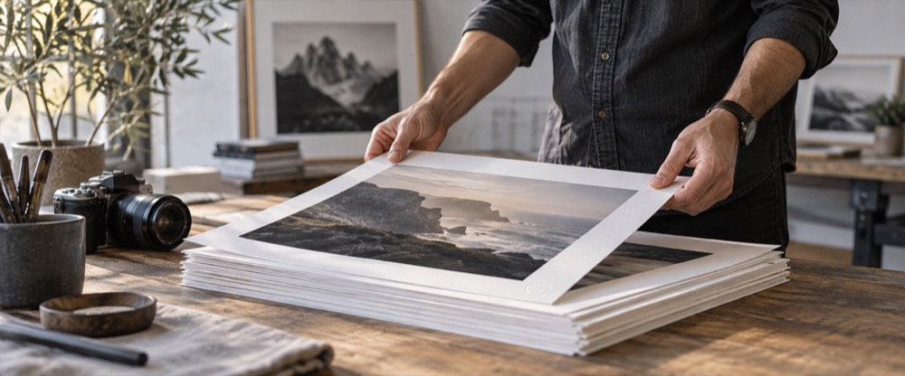
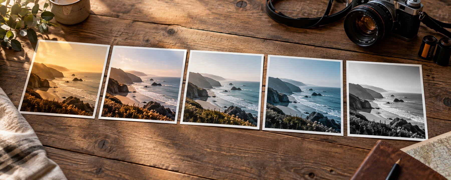

Photographic visual for Black And White Is A Channel Decision

Black And White Is A Channel Decision

Black and white is a channel decision

Taking the colour out of a photograph is not one operation with one answer. It is a choice about which colours are allowed to become light and which become dark, and the choice is the whole picture.

What you are really being asked

A colour pixel carries three numbers. A grey pixel carries one. Somewhere between those two facts a decision has to be made about how the three become the one, and every monochrome photograph you have ever seen is the consequence of somebody making it — usually without being told they were.

The default answer, the one a saturation slider gives you, weights green most heavily, red moderately and blue barely at all. Roughly 21 per cent red, 72 per cent green, 7 per cent blue, in the weighting most screens and most software use. Those numbers are not arbitrary: they approximate how sensitive human vision is to each part of the spectrum, so the grey that comes out looks about as bright as the colour that went in. As a measurement that is exactly right. As a photograph it is often the dullest of the available options.

The trouble is that “about as bright as it was” means two things that were different colours but similar brightness become the same grey. A red door in a grey stone wall, a green sign against a blue sky, a warm face in front of a cool window — all of them can vanish into their background under the default weighting, not because the photograph is weak but because the conversion threw away the only thing that was separating them.

Moving the weights

Push the weight onto red and anything red becomes light while anything cyan or blue becomes dark. A blue sky contains almost no red, so it drops to near black and the clouds — which are white, and therefore full of red as well as everything else — stay bright. That is the famous dramatic-sky conversion, and it is three numbers, not a preset.

Push the weight onto green and foliage lifts. Grass and leaves reflect a lot of green and little else, so they move from the muddy mid-grey the default gives them to something bright and separated. Skin goes the other way: the warm areas and any blemish in them carry more red than green, so they darken and become more visible, which is either useful documentary honesty or a problem depending on why you are there.

Push the weight onto blue and you get the least flattering and most atmospheric of the three. Skin goes dark and mottled, skies go pale and flat, and shadows fill with the noise that lives in the blue channel of almost every digital sensor. Used deliberately it reads as cold and grainy. Used by accident it reads as a mistake.

The eight in the pack

The Mono set on the rail is eight fixed weightings, chosen to span the useful range rather than to be subtle variations on each other. Open a photograph, press 4 to narrow the rail to the pack, and the differences between them are immediately visible on your own picture in a way no description manages.

LookWhat it does
Plain MonoLuminance weights, unmodified. The reference every other entry in this pack departs from.
Hard MonoThe same weights with the contrast driven up until the midtones separate sharply.
Red FilterWeighted heavily to red: blue sky goes nearly black and cloud stands off it.
Orange FilterThe landscape weighting — sky darkened, but less brutally than red, and skin kept light.
Yellow FilterA gentle darkening of blue. The one to reach for when the others look theatrical.
Green FilterGreen weighted up: foliage lightens, lips and warm marks on skin darken and read clearly.
Soft SilverLow contrast with the black point lifted, so the darkest area is grey rather than empty.
Deep BlackBlue weighted up and the toe pulled down, which puts most of the shadow detail away.

Two of those eight are not about the weights at all. Soft Silver and Deep Black start from ordinary weightings and then differ in what happens to the tones afterwards — one lifting the darkest area to a grey so nothing is empty, the other pulling the bottom end down so the shadows close up. Those are curve decisions stacked on a channel decision, which is the order the whole engine works in.

Choosing one, in about ten seconds

Look at your photograph in colour and find the two things that most need to stay apart from each other. Then ask which channel they differ in most. If it is a warm subject against a cool background, a red-weighted conversion will separate them hardest and an orange one more gently. If it is foliage against sky, green. If the photograph is mostly neutral — architecture, snow, a grey day — the weights barely matter and the decision becomes a contrast one instead, which is where Hard Mono and Soft Silver come in.

Then hold the space bar. The colour version coming back for a second tells you whether the separation you thought you were preserving actually survived.

What this release does and does not give you

The eight weightings on the rail are fixed. A channel mixer — three sliders you move yourself, watching the grey change as you go — is the natural next step and is not in this release. What is here is eight positions on that same dial, chosen to be far enough apart to be worth switching between, with the strength slider available to land between a conversion and the colour original if a partial one is what you want.

  • A monochrome conversion cannot recover separation that the file does not contain. Two things that were genuinely the same colour and the same brightness will be the same grey under every weighting there is, because there is nothing in the three numbers to tell them apart. No amount of channel juggling invents a difference that the sensor did not record.
  • Weighting a channel up also weights up whatever noise that channel is carrying. The blue channel of most digital files is the noisiest of the three, so Deep Black — which leans on blue — will show more texture in the shadows of a high-ISO frame than the others do. That is the honest consequence of the operation rather than a flaw in it, and the strength slider is the way to take some of it back.

Questions this raises

Why does pulling the saturation down give such a flat result?
Because it throws the decision away rather than making one. Desaturating collapses every colour onto the standard luminance weighting and stops there, and that weighting was chosen so that a grey looks as bright as the colour it replaced — which is a perceptual goal, not a pictorial one. The result is accurate and dull: a red jumper and a green hedge of similar brightness become the same grey, and the picture loses the separation that made it worth taking.
What do the eight Mono looks actually differ in?
Three numbers each: how much red, how much green and how much blue goes into the grey, plus what happens to the contrast afterwards. Red Filter puts most of the weight on red, so a blue sky — which has almost no red in it — goes nearly black and any cloud stands off it hard. Green Filter does the opposite and lifts foliage while darkening the warm marks in skin. Nothing else about them is different.
Do the weights have to add up to anything in particular?
In practice they should add to roughly one, or the whole picture gets brighter or darker as a side effect of the conversion rather than as a choice. Every weighting in the Mono pack sums to one for that reason, so switching between them changes what separates from what without changing the overall exposure of the frame. Where a look here is meant to be darker or lighter, that is done deliberately by the curve afterwards, not smuggled in through the weights.
Can I get the same effect by putting a physical filter on the lens?
That is exactly where the names come from, and for film it was the only way to do it: a yellow, orange or red glass filter in front of the lens blocks part of the blue end of the spectrum before it reaches the emulsion, so the sky records darker. Doing it after the fact on a colour file gets you to a very similar place with two advantages — you can change your mind, and you have not thrown away two stops of light to do it.

Back to the rail